11 · UI/UX
Airaa: Flight Booking
End-to-end UX case study: a low-friction flight booking website for a startup airline, from research to a working prototype.
Product Airaa
A flight booking website for a startup airline, designed as the final case study of my Professional Diploma in UX Design (UX Design Institute). The goal was an end-to-end booking experience that removes the usual friction points.
Details
- E-commerce · Flight booking website
- surface
- End-to-end UX designer, solo
- role
- Survey (10), interviews (8), usability tests (8)
- research
- Hick’s Law · Information architecture · Error prevention
- focus
- Figma · Procreate · Miro · HTML/CSS/JS
- tools
Problem Rigid Flows That Punish Mistakes
Airline interfaces are often cluttered, split across many page loads, and costly to correct: changing a date can mean starting over. Interviews showed anxiety peaking at checkout, with no clear way to recover from a wrong entry. The brief: balance upselling and data collection against a simple, low-friction booking.
Solution One Linear, Editable Flow
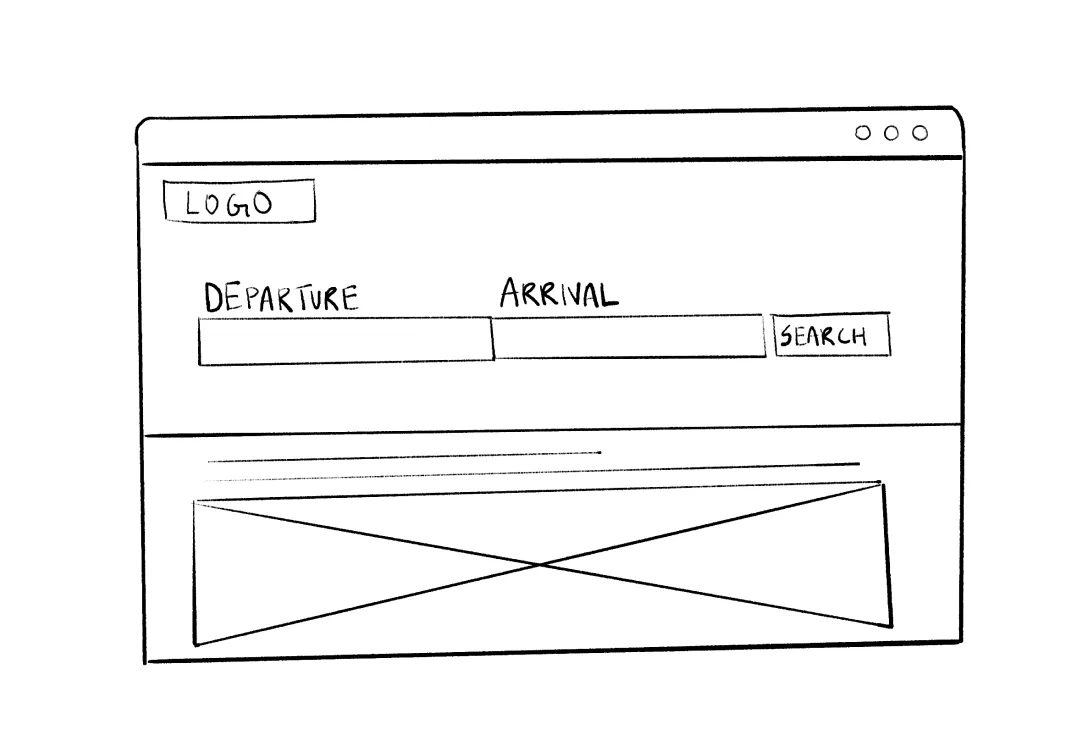
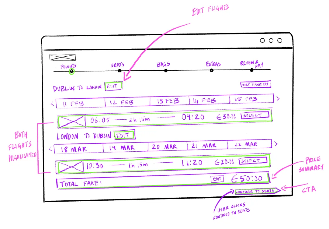
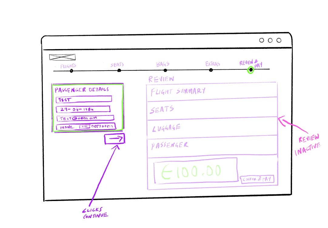
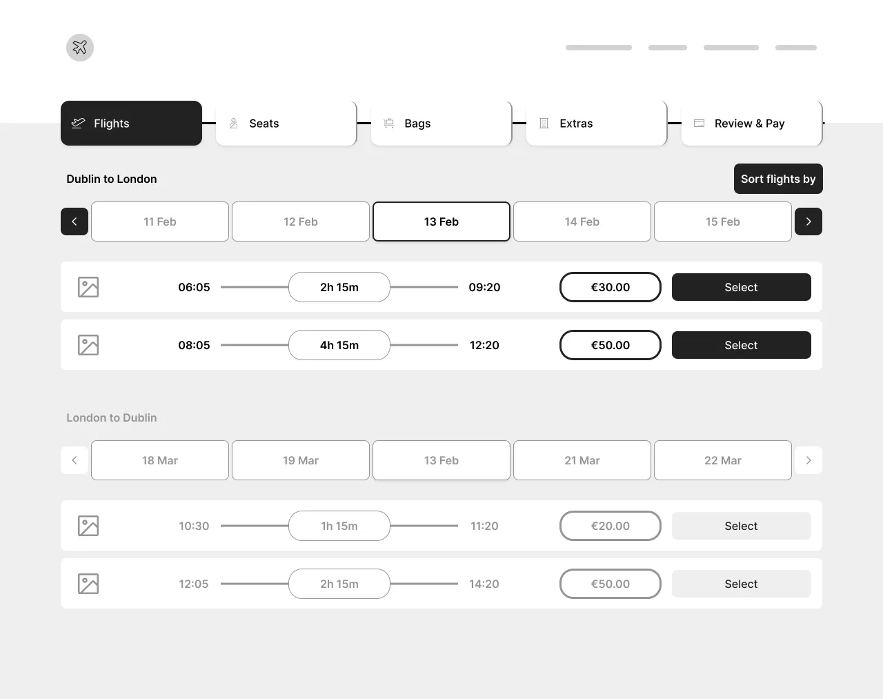
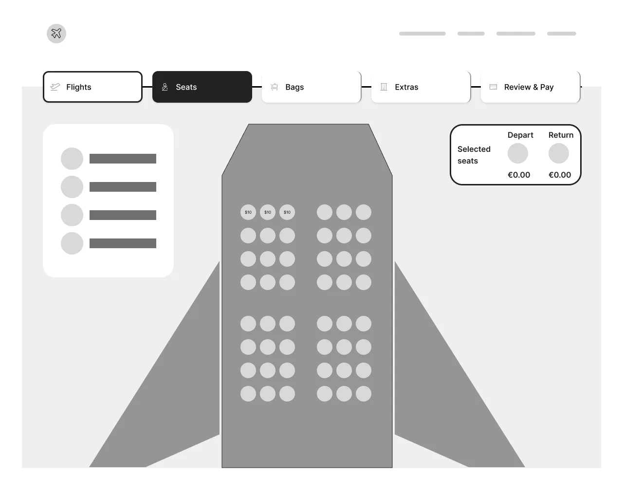
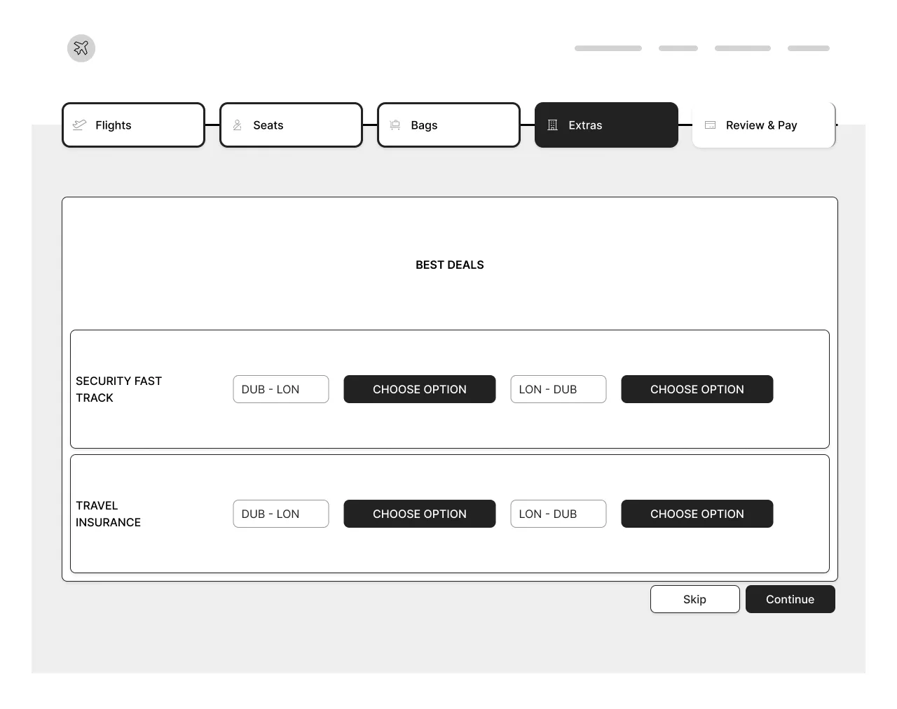
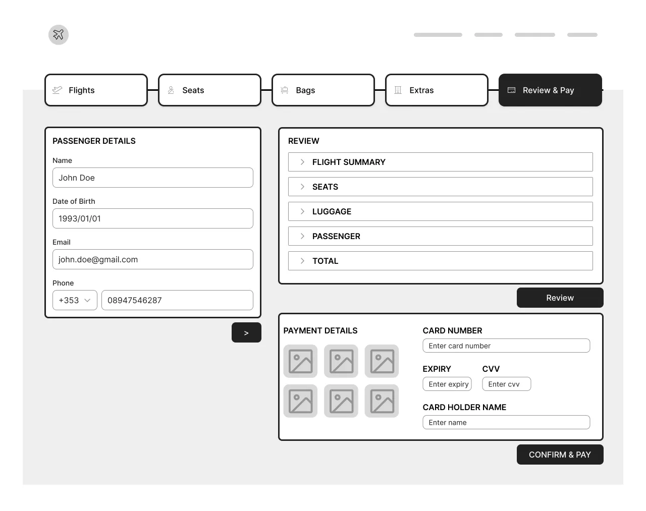
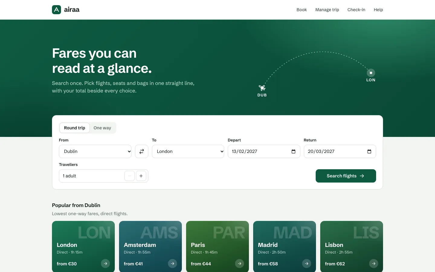
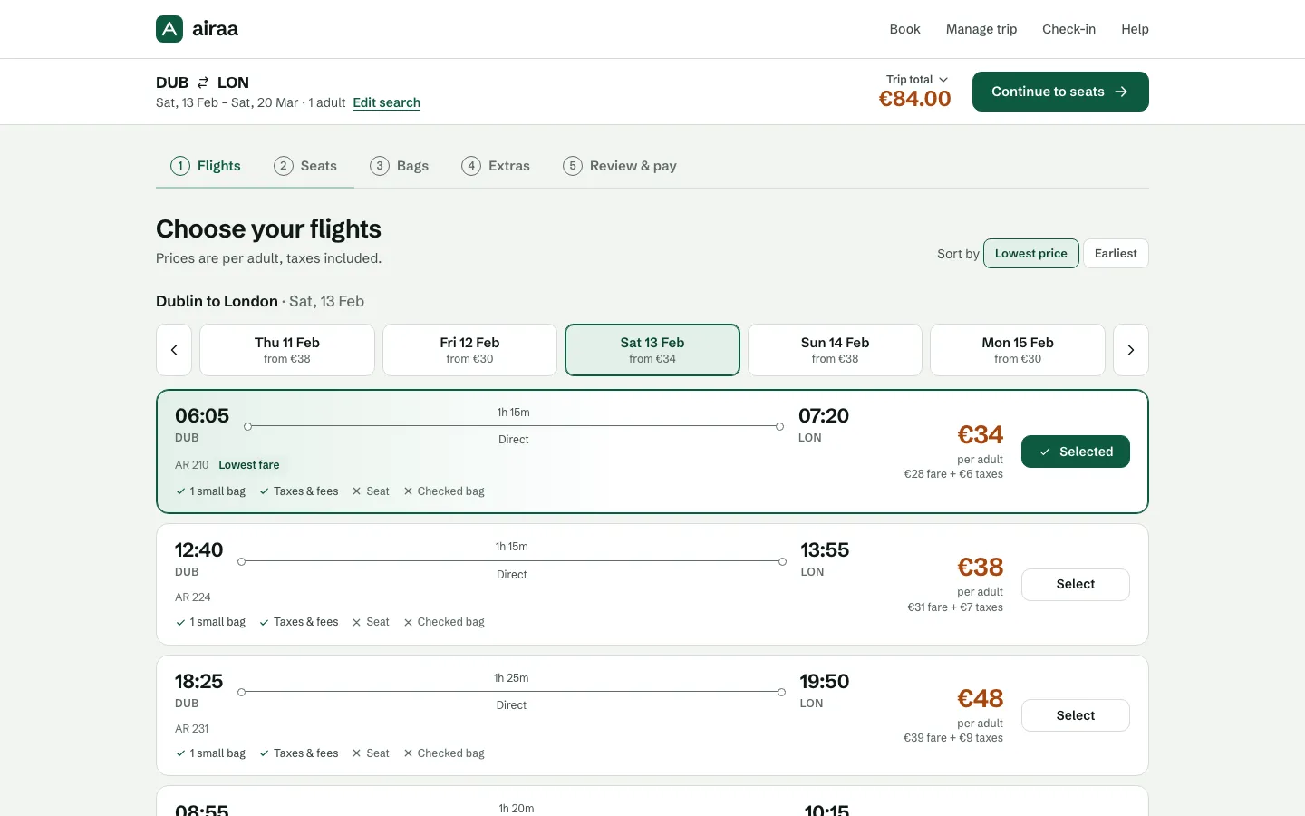
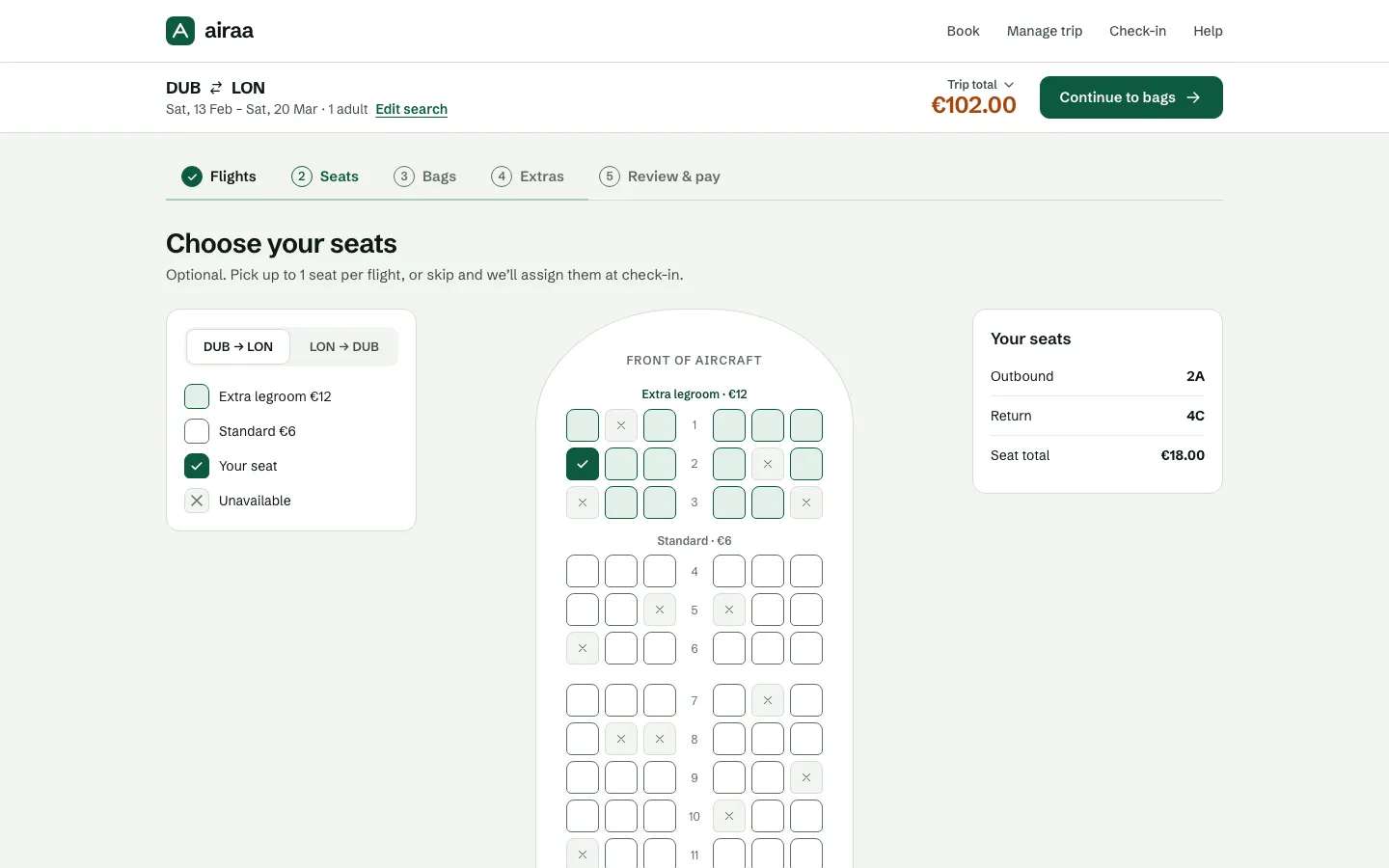
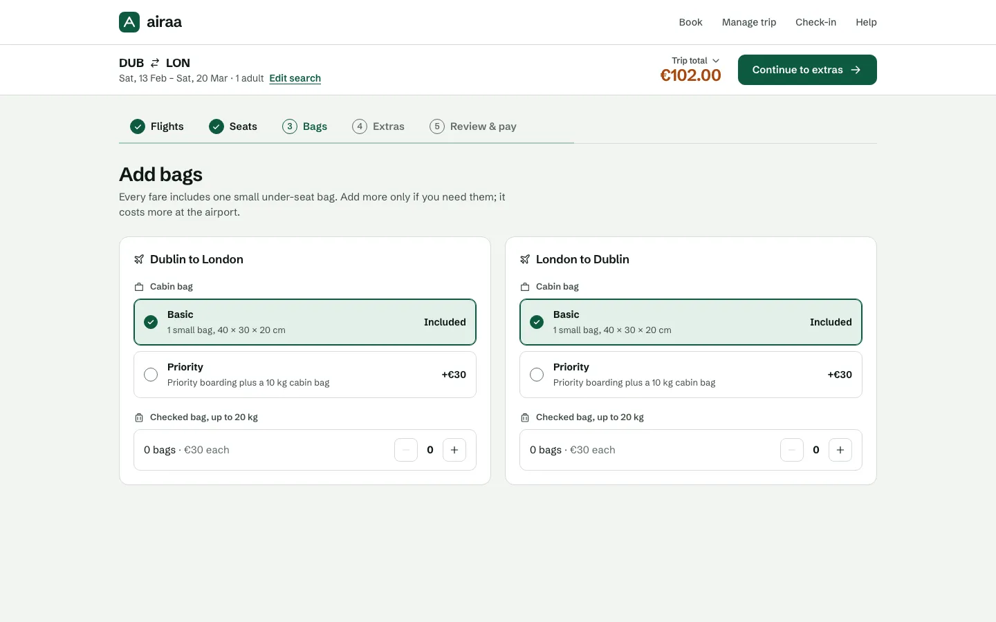
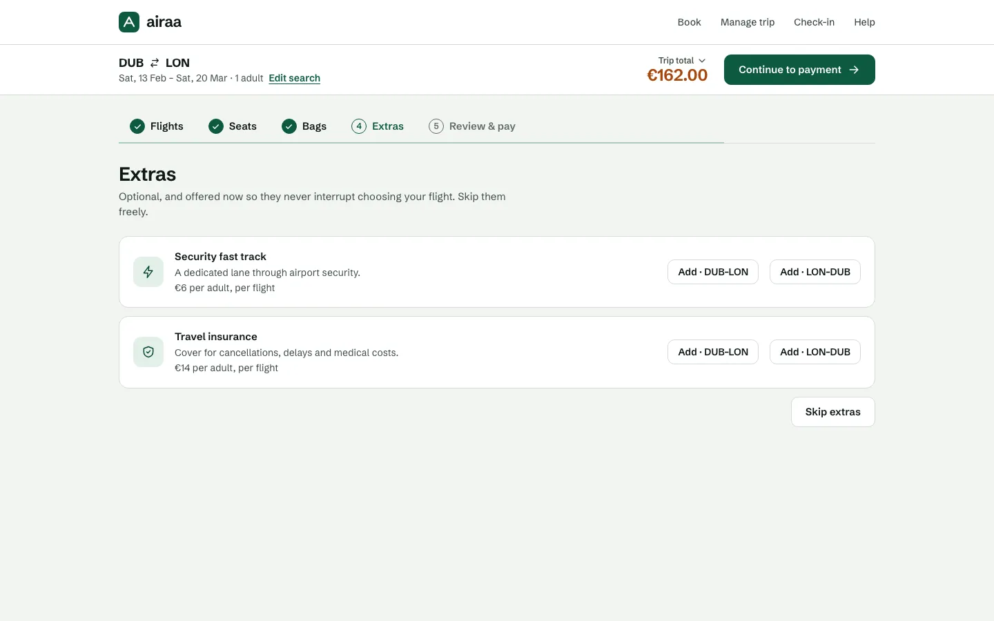
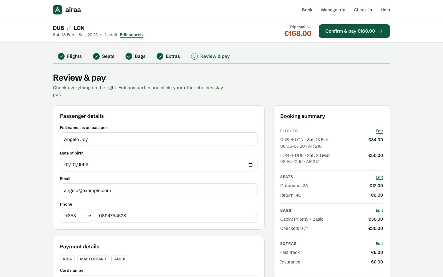
A single-direction, desktop-first flow where the price stays visible, dates, passengers and seats can be edited without losing progress, and hotel and car style offers move to the end of the funnel. Sketched in Procreate, mapped in Figma, then rebuilt as a styled, interactive prototype.
Result Validated With 8 Participants
A complex booking funnel became a clearer, more forgiving experience through content hierarchy and inline editing, tested in moderated usability sessions on the Figma wireframe prototype. This was an academic project, so success is measured through the testing rather than live conversion data.
Impact
- 80%of survey respondents prefer desktop for final booking
- 60%named price as their main motivator
- 7 screensfrom flight search to checkout
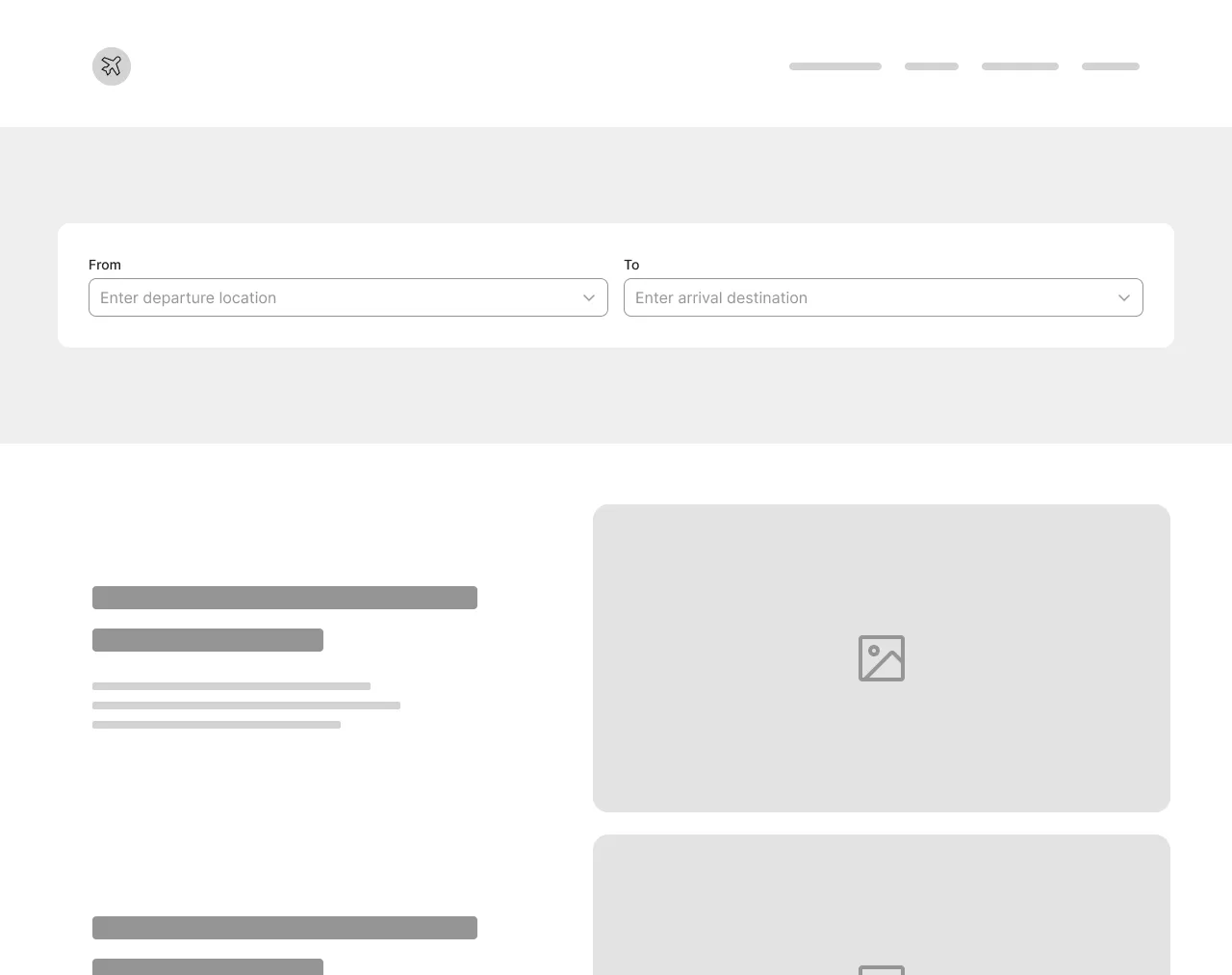
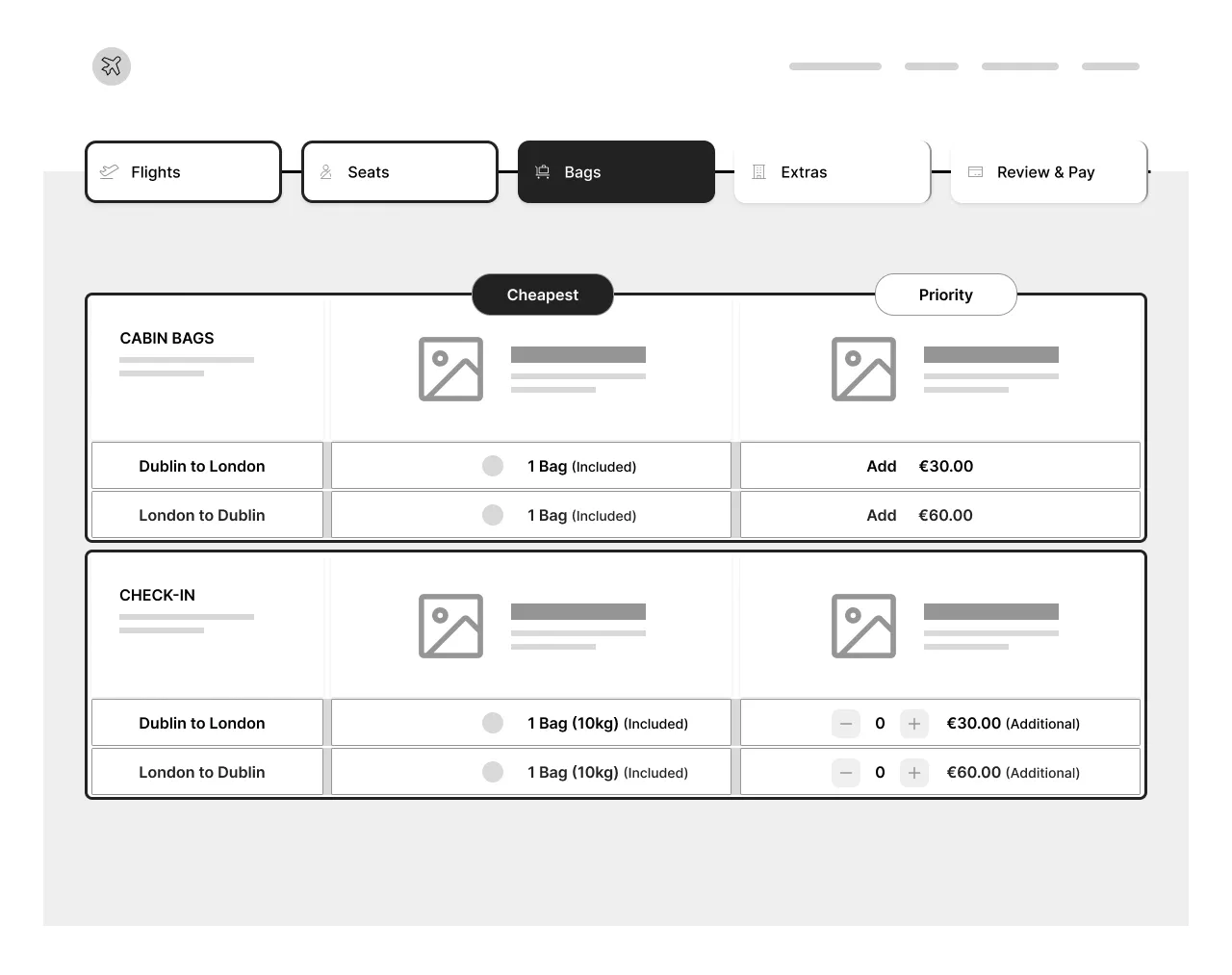
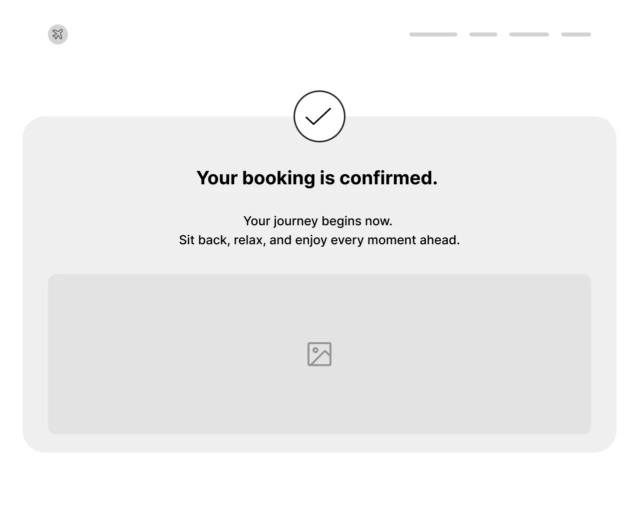
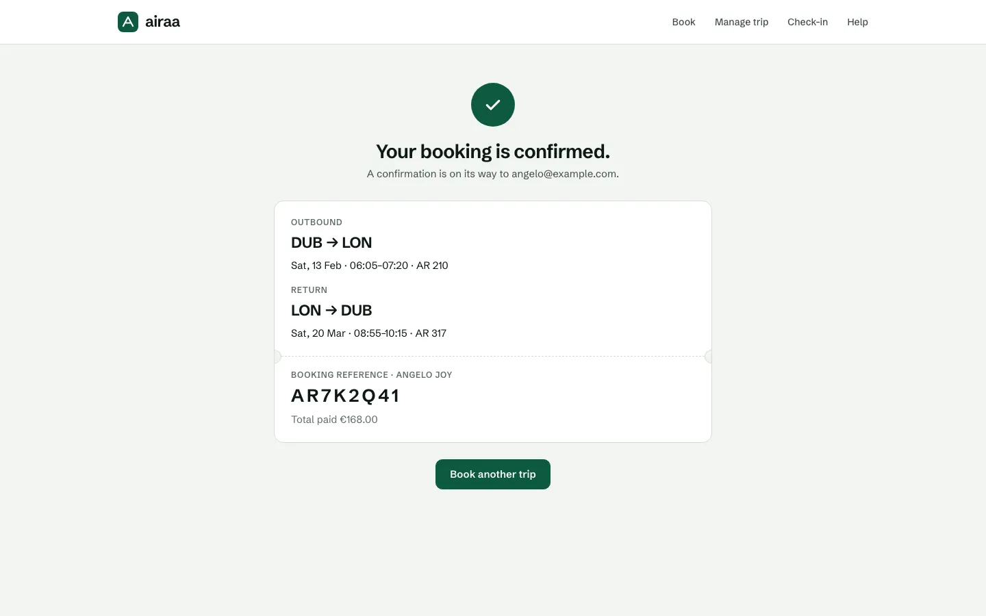
The prototype below is a styled, working rebuild of the wireframed flow: search, flights, seats, bags, extras, then passenger details and payment on one screen. Use the stepper to jump back and change a choice; nothing you picked is lost. It is a personal build made after the usability sessions, which ran on the Figma wireframe prototype. All fares and flights are illustrative.